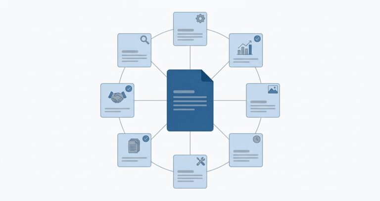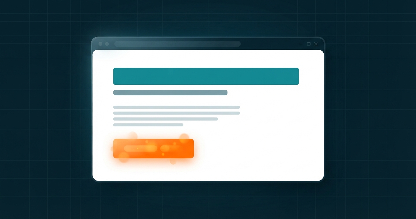
How to Create a Landing Page That Converts: A Beginner's Guide
You pay for an ad, or send an email, or post a link. People click. They arrive on your homepage, see a menu with seven options and a slider, and leave. Nothing was wrong with the offer. The page simply asked them to work out what to do. A landing page removes that work: one page, one message, one action.
A landing page is a standalone page built for one goal, such as a sign-up, a booking or a sale. To create one: choose a single goal, write a headline that states the main benefit, add a short supporting description, show proof, and repeat one clear call-to-action button. Remove anything that does not help the visitor take that action, including the main navigation. Then test it on a phone and measure how many visitors convert.
- One page, one audience, one action. Every extra link is a way out.
- The headline does most of the work. Visitors decide in seconds whether to stay.
- The page must match the ad, email or post that sent the visitor there.
- Clear beats clever. Plain words and one obvious button outperform decoration.
What a landing page is
In everyday speech, a landing page is any page a visitor arrives on. In marketing it means something narrower: a page designed around a single objective, usually reached from an advert, an email, a social post or a QR code.
The difference from a homepage is purpose.
| Homepage | Landing page | |
|---|---|---|
| Job | Introduce the whole business and route visitors | Get one specific action |
| Audience | Everyone | One group, from one source |
| Navigation | Full menu | Minimal or none |
| Links | Many | One main action, repeated |
| Content | Broad overview | Focused on one offer |
| Measured by | Engagement across the site | Conversion rate |
Conversion simply means a visitor did the thing the page was built for. Conversion rate is conversions divided by visitors. If 400 people visit and 12 sign up, the rate is 3 percent.
Common types
- Lead capture page: collects contact details in exchange for something useful, such as a guide, a quote or a newsletter.
- Click-through page: explains an offer and sends the visitor on to a checkout or sign-up.
- Sales page: makes the full case for a product and asks for the purchase.
- Event or webinar page: gives the details and takes registrations.
- Coming-soon page: collects interest before launch.
Why a focused page works
Give people many choices and they often make none. A homepage offers a dozen directions. A landing page offers one, which is why it usually converts better for a specific campaign.
Three practical reasons:
- Message match. If the ad says "Free website audit", the page should open with "Free website audit", not "Welcome to our agency". A mismatch makes visitors feel they are in the wrong place.
- Less distraction. No menu, no sidebar, no unrelated offers.
- Clear measurement. One page and one goal means you can tell whether a change helped.
The anatomy of a landing page
The main benefit
What the visitor gets, in one line. Specific and plain.
The supporting line
One or two sentences that explain how, for whom, or by when.
One button
A verb and an outcome: "Get my free quote", "Start the trial".
Show the thing
The product, the result or the person. Not a generic stock photo.
Three to five points
What changes for the visitor. Outcomes before features.
Reasons to believe
Real reviews, client names, numbers you can back up, guarantees.
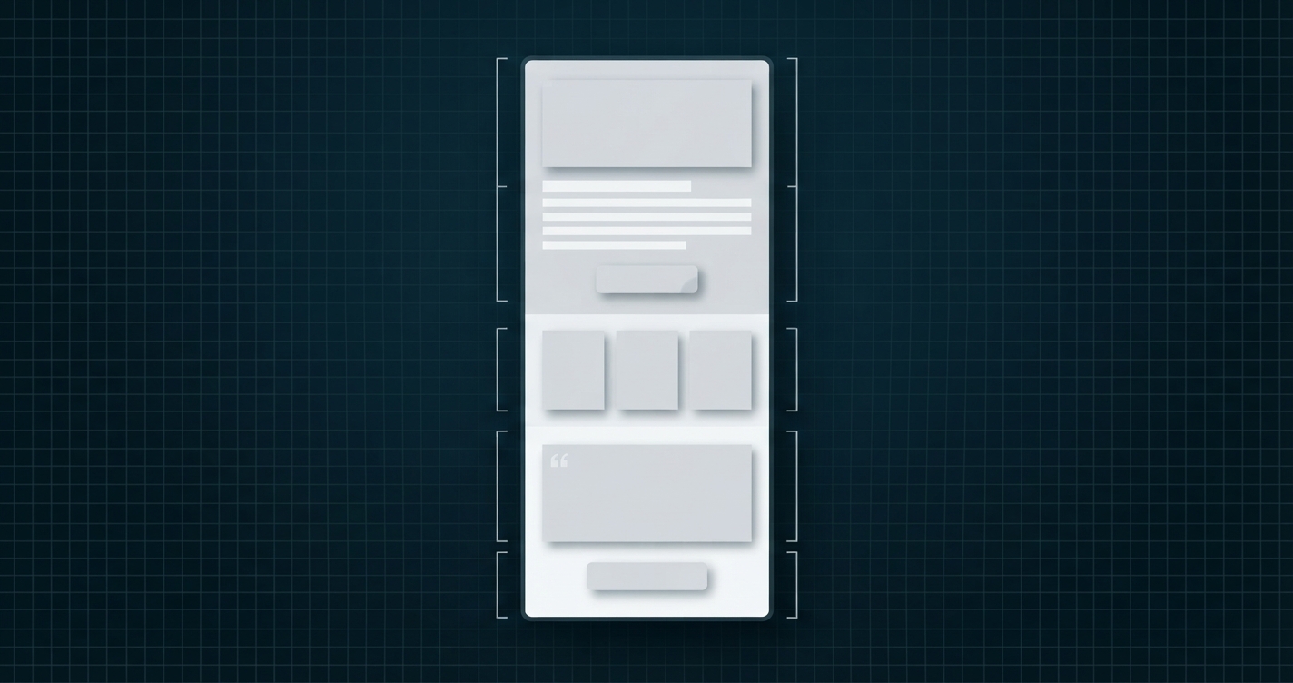
Longer pages add an explanation of how it works, answers to common objections in a short FAQ, and the call to action again at the end. The top section, visible without scrolling, should make sense entirely by itself: headline, supporting line, button.
Never invent testimonials, reviews, client logos or statistics. It is dishonest, it breaches advertising and consumer-protection rules in many countries, and it can get ad accounts suspended. If you have no proof yet, describe exactly what the customer receives and offer a clear guarantee or a free first step instead.

How to create a landing page, step by step
- Pick one goal. Sign up, book a call, download, buy. If you have two goals, build two pages.
- Define the visitor. Where are they coming from, what do they already know, and what is stopping them?
- Write the headline. State the main outcome. "Get a clear website quote in 24 hours" beats "Innovative digital solutions".
- Write the supporting line. Add how it works or who it is for.
- Write the button. Complete the sentence "I want to...". "Get my quote" is stronger than "Submit".
- List three to five benefits. Each one line, each about the visitor.
- Add proof you really have.
- Answer the top objections. Price, time, risk, what happens next.
- Remove distractions. Take out the main menu, sidebars and unrelated links. Keep the legal links in the footer.
- Build it. Use your website builder's landing page template, a WordPress page with a full-width or blank template, or plain HTML.
- Check it on a phone, test the form or button, and add tracking.
- Send traffic and measure. Then change one thing at a time.
Write the page as plain text first: headline, line, button, three benefits. If it does not persuade in a text document, design will not rescue it. The mini builder below works the same way, words first.
Free mini landing page builder
Type your own headline, description and button, pick two colours, and watch the preview change as you type. When you are happy, copy the HTML or download it as a working page.
Loading the tool. If this message does not disappear, JavaScript is being blocked or changed on this page.
Mini Landing Page Builder
Browser-based tool
A small live editor that runs in your browser. No AI, no account, nothing saved or sent.
Must start with https://, http://, mailto:, tel: or #. Anything else is replaced with #.
Live preview
How the tool works
Every field feeds a small template. Each time you type or move a control, your browser rebuilds a complete HTML page and shows it in the preview frame, so what you see is the real page. The contrast check uses the standard WCAG formula to compare your text and background colours. Copy puts the HTML on your clipboard; Download saves it as an .html file you can open in any browser or upload to a web host. Nothing is saved or sent anywhere. It is a simple one-section demo for learning; it has no form handling, images or hosting. For a fuller version with sections, see the builder in our guide on how to build a website.
Practical examples
| Element | Weak | Stronger |
|---|---|---|
| Headline | Welcome to Our Website | A Faster WordPress Site in 7 Days, or You Don't Pay |
| Headline | Next-Generation Synergy Platform | Send Invoices in 60 Seconds From Your Phone |
| Supporting line | We are passionate about quality. | We fix the five things slowing your site, test it and send you the before-and-after report. |
| Button | Submit | Get my free speed report |
| Benefit | Advanced caching technology | Pages that load before visitors lose patience |
Only make a promise like "or you don't pay" if you will honour it. A real guarantee is powerful; a fake one is a liability.
A simple structure for a local service
- Headline: the service and the area. "Boiler Repair in Leeds, Usually Same Day".
- Supporting line: who does the work and how quickly you respond.
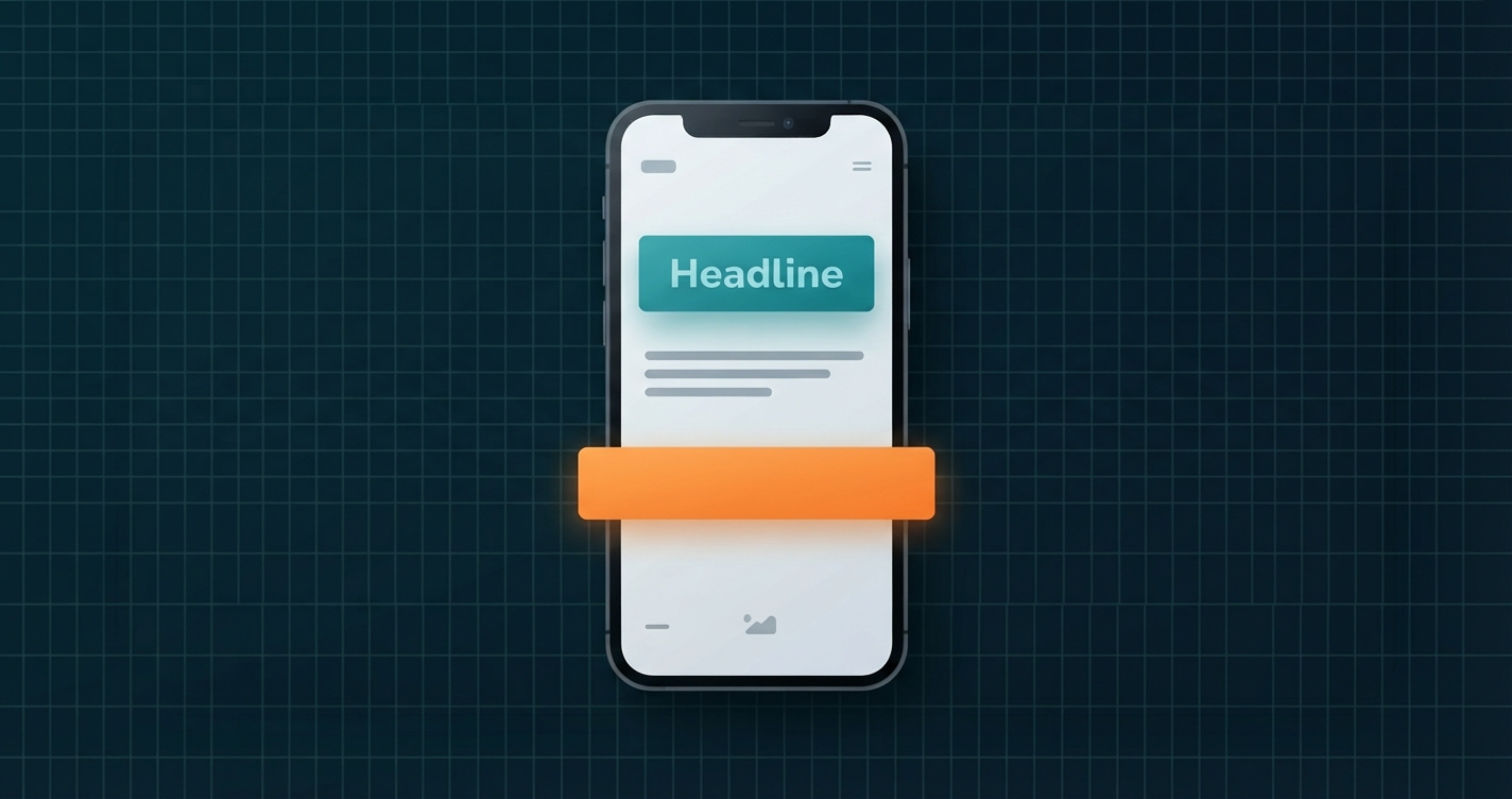
- Button: "Call now" on mobile, with the number visible; "Request a callback" as the alternative.
- Three benefits: fixed prices, qualified engineers, guarantee.
- Proof: genuine reviews with names, accreditation logos you are entitled to use.
- FAQ: prices, areas covered, opening hours.
- Button again.
Ways to build a landing page compared
| Method | Good for | Trade-off |
|---|---|---|
| Website builder template | Fast launch with no technical work | Design limited to the platform's options |
| WordPress page with the block editor | Sites already on WordPress | Needs a theme template without header clutter |
| WordPress page-builder plugin | Detailed drag-and-drop control | Adds page weight; another plugin to maintain |
| Dedicated landing page service | Campaigns with built-in testing and forms | Monthly cost; pages live on another platform |
| Hand-written HTML | Speed, full control, learning | You handle forms and hosting yourself |
Pros of a dedicated landing page
- Higher focus than a homepage
- Matches each campaign's message
- Easy to measure and improve
- Quick to build and change
Cons
- One more page to maintain
- Thin pages rarely rank in search
- Needs traffic sent to it
- Many pages can drift out of date
Common mistakes
- More than one goal. "Buy now, or subscribe, or follow us" splits attention.
- A vague headline. If a stranger cannot say what you offer after five seconds, rewrite it.
- Mismatch with the ad. Different wording or offer from the link that brought them.
- Too many form fields. Ask only for what you need to take the next step.
- Weak button text. "Submit" and "Click here" say nothing about the result.
- Low contrast. Pale text on a pale background, or a button that blends in.
- Slow loading. Paid clicks are wasted if the page takes too long. Keep images light; see our website image size guide.
- Not checking on a phone. Most campaign traffic is mobile.
- No tracking. Without measurement you cannot improve.
- Fake urgency. Countdown timers that reset and "only 2 left" claims that are not true damage trust and can breach consumer law.
Advanced tips
- Test one change at a time. Headline first, then button, then layout. Give each version enough visitors before deciding.
- Tag your links. Use UTM parameters so you know which source converts. Our UTM parameters guide includes a link builder.
- Add a thank-you page. It confirms the action, sets expectations and gives you a clean conversion to track.
- Keep campaign pages out of search if they duplicate others. Use a canonical tag or noindex for near-identical variants.
- Write the SEO title and description anyway. They appear when the link is shared. Test them with our title and meta description tester.
- Follow privacy rules. If you collect personal data, link to your privacy policy and get consent where the law requires it.
Landing page checklist
FAQ
A landing page is a standalone web page built for one goal, such as collecting sign-ups or selling a product. Visitors usually reach it from an advert, email or social post.
A homepage introduces the whole business and offers many paths. A landing page focuses on one offer and one action, with little or no navigation.
Yes. Many website builders include free plans or templates, WordPress can make one with its block editor, and a simple page can be written in HTML. Your own domain and hosting usually cost money.
No. A landing page can stand alone on a builder's subdomain or its own domain. Having a full site adds credibility and somewhere for curious visitors to learn more.
Long enough to answer the visitor's questions. A free newsletter needs a few lines. An expensive product needs explanation, proof and objections answered. Keep the first screen clear in either case.
It varies widely by industry, offer, price and traffic source, so published averages are a rough guide at best. Compare your page with its own earlier results and aim to improve it.
Usually not. Removing the main menu keeps attention on the single action. Keep the logo and the legal links.
Short campaign pages rarely rank, because they have little content. Pages designed to rank need depth. Many businesses use both: detailed pages for search, focused pages for campaigns.
Yes. Download the file and upload it to your host, or copy the HTML into your site. It is a simple static page with no form, so link the button to your sign-up, booking or contact page.
Final recommendation
Creating a landing page is an exercise in leaving things out. Choose one goal, say the benefit plainly in the headline, support it with one honest line, show real proof and give visitors a single obvious button. Draft yours in the mini builder above, read it on your phone, and ask one person what the page is offering. If they can answer in five seconds, send the traffic and start measuring.
Official references
- Google Ads Help: landing page definition
- W3C: Understanding WCAG contrast (minimum)
- WordPress.org documentation: block editor
- web.dev: Web Vitals
Related articles
Digital marketingUTM parameters explained
Online toolsWebsite image size guide
Next step
Build your first draft above and download it. Need a stronger headline? Generate options with the tool in our guide to blog title ideas.