Home › Website Building › Color Contrast for Websites
Website Building · Accessibility
Color Contrast for Websites: How to Make Your Blog Readable for Everyone
Light grey text on white looks elegant in a theme demo and unreadable on a phone in sunlight. This guide explains what a contrast ratio is, what the WCAG AA and AAA levels require, how to audit your WordPress theme in fifteen minutes, and how to fix failing colors without a redesign — with a free contrast checker that suggests a passing shade.
What a contrast ratio actually measures
Contrast ratio is a single number that compares how much light a text color and its background give off. It runs from 1:1 (identical colors, invisible text) to 21:1 (pure black on pure white). It is not about hue — red on green can have terrible contrast, and so can two shades of blue — it is about luminance, roughly how bright a color looks to the human eye.
The formula, defined by the W3C, converts each color's red, green and blue channels into a relative luminance between 0 (black) and 1 (white), weighting green most heavily because our eyes are most sensitive to it. The ratio is then (L1 + 0.05) / (L2 + 0.05), where L1 is the lighter of the two. The 0.05 stands in for ambient light reflecting off a screen, which is why even pure black on pure white stops at 21.
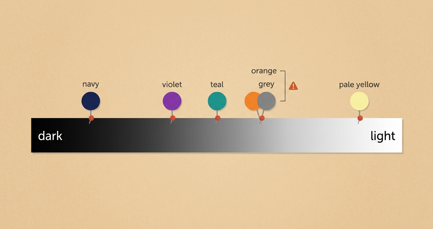
Two consequences surprise people. First, the ratio is symmetrical: white on violet scores exactly the same as violet on white. Second, lightness matters far more than saturation. A vivid orange and a dull grey can have the same luminance, and if you put one on the other the text all but disappears. This is why "it looks fine on my monitor" is not a test — your monitor is bright, sharp and indoors.
You do not need to do this arithmetic by hand. The checker in this article does it for you, and so do browser developer tools. The point of understanding the formula is knowing what you are fixing: the brightness gap, not the choice of color.
WCAG levels: AA, AAA, large text and UI components
The Web Content Accessibility Guidelines (WCAG) set the thresholds that most laws, auditors and design systems use. WCAG 2.2 is the current W3C Recommendation. The text-contrast thresholds have stayed the same since WCAG 2.0; version 2.1 added the 3:1 rule for interface components and graphics. Level AA is the usual professional and legal target; AAA is stricter and optional for most sites.
| What | Level AA (target) | Level AAA (enhanced) | Examples on a blog |
|---|---|---|---|
| Normal text Below 18pt regular (24px) or 14pt bold (about 18.7px) |
4.5:1 | 7:1 | Body paragraphs, captions, menu items, form labels, footer text |
| Large text 18pt+ regular or 14pt+ bold |
3:1 | 4.5:1 | Headings, hero titles, pull quotes, big button labels |
| UI components and graphics | 3:1 | — | Input borders, checkbox outlines, focus rings, icons that carry meaning, chart lines |
| Logos and decorative text | No requirement | Your logo, text inside a photo that is purely decorative | |
| Inactive controls | No requirement | A greyed-out "Submit" button that cannot be used yet | |
Points versus pixels. WCAG measures text in points; CSS usually uses pixels. 1pt = 1.333px, so 18pt is 24px and 14pt is about 18.67px. A bold 18px heading is not quite large text; a bold 19px heading is. The checker below converts the size for you.
Two cases are easy to miss. Placeholder text inside a form field is real text to the person reading it, and accessibility auditors generally hold it to the same 4.5:1 — most themes fail this. And if your links are told apart from the surrounding text by color alone, W3C technique G183 asks for at least 3:1 between the link color and the text around it, plus a non-color cue such as an underline when the link is hovered or focused. Keeping underlines on links avoids the problem completely.
Why bloggers should care
Accessibility is often framed as a legal duty, and in many places it is one — the European Accessibility Act began applying to many online services in June 2025, and accessibility lawsuits against US websites are filed every year. We are not lawyers and this is not legal advice; check the rules that apply to your market. For a blog, though, the stronger argument is simpler: contrast is readability, and readability is the product.
Readers do not complain about grey text. They leave. Time on page drops, fewer people scroll, and fewer come back. Google's AdSense program policies ask publishers to ensure "a good experience for users" and say sites showing ads "should be easy for users to navigate". Contrast is not named, but faint text is one of the first things a visitor on a phone notices. If you are working through our AdSense approval checklist, fixing contrast is one of the quickest wins on the list.
Good contrast is invisible. Nobody praises it; everybody benefits from it.
There is also a plain writing argument. You have already worked to make your sentences clear — our readability score guide covers that side. Visual readability is the other half: if the words are easy but the letters are faint, the reader still gives up.
Free contrast checker — the Contrast Lab
Enter a text color and a background color, as hex codes or with the color pickers. The lab calculates the exact WCAG contrast ratio, grades it against every AA and AAA threshold, previews real page elements in those colors, and — when a pair fails — suggests the nearest darker or lighter shade of your text color that passes. Everything is calculated in your browser with the W3C formula. Nothing is sent anywhere, and no AI is involved.
Contrast Lab
WCAG formula · runs locally
Results update as you type. Accepts #1a1530, #abc or rgb(26, 21, 48).
Loading the Contrast Lab… If this message stays, your site is blocking inline scripts — see the setup instructions.
AA is the usual target.
Try an example
Enter two colors to begin.
Heading at 24px bold
Body text at 16px. The quick brown fox jumps over the lazy dog while the editor checks the contrast of every paragraph on the page.
Caption or meta text at 13px — usually the first thing to fail.
Button labelA text link
The lab uses the WCAG 2 relative-luminance formula and shows ratios rounded down, as WCAG requires (4.499 is a fail, not 4.5). It cannot see your live page, so take the real colors from your theme settings or your browser's inspector, and check text over images or gradients at their lightest and darkest points.
Audit your WordPress theme in 15 minutes
You do not need to test every pixel. Most themes reuse a handful of color pairs everywhere, so checking the pairs below covers most of what readers see. Open a published post on your phone and on a laptop, then work through the list with the lab above.
- Body text on the page background. The most important pair on the site. Aim well above 4.5:1 — 7:1 or more costs nothing and helps everyone. Black on white is fine; "too harsh" is a designer's complaint, not a reader's.
- Secondary text: dates, author lines, captions, excerpts. Themes love a soft grey here, but it is normal-size text and must still reach 4.5:1. To read the exact colors, right-click the text → Inspect, and look at the computed
colorandbackground-color. - Links in body text. 4.5:1 against the background. If they are not underlined, they also need 3:1 against the surrounding text, which is close to impossible with a mid-grey body color. The simple fix: keep underlines.
- Buttons. The label against the button color. White labels on bright mint, orange or sky-blue buttons often land around 2.5–3.5:1, which passes only for large text. Darken the button or use a dark label.
- Form fields. Placeholder text (usually fails), typed text, and the field border against the page (3:1, because it is a UI component). Your comment form and newsletter box are where visitors take action; do not make them guess.
- Navigation and footer. Menu items against the header color, footer links against the footer color, and the hover state of each — hover is where a dark link often turns into a light accent that fails.
- Text over images and gradients. Check the lightest area of the image behind the text. If any part fails, add a solid or semi-transparent overlay behind the text, or move the text off the image.
- Dark mode, if your theme has one. Repeat the body-text and link checks with the dark palette. Light grey on dark grey fails as often as the reverse.
Where the colors live. GeneratePress: Appearance → Customize → Colors (a global palette plus per-element settings). Elementor: Site Settings → Global Colors (under Design System). Block themes: Appearance → Editor → Styles → Colors. Change a global color once and every element that uses it updates — which is why checking the palette first saves time.
Fix failing colors without a redesign
A failing pair almost never needs a new color. It needs the same color, slightly darker or lighter. Because contrast depends on luminance, you can keep your brand hue and adjust only its lightness until the ratio passes — exactly what the lab's "Suggest a passing text color" button does. A few patterns cover most cases:
Grey text that fails
Move from the #999–#aaa range to #595959 or darker. #767676 on white is the lightest neutral grey that passes AA (4.54:1) — it is the lab's starting value, so you can see it.
Bright brand button
Keep the hue and lower the lightness by 10–20%, or switch the label to a near-black. Either way the brand stays recognisable.
Colored link on a colored panel
Use a near-white or near-black link on tinted panels instead of a second brand color. Two mid-tone hues rarely clear 4.5:1 together.
Text on a photo
Add a 40–60% dark overlay, a blurred backdrop or a solid label box. Contrast checkers ignore text shadows, and shadows rarely rescue text on a busy photo.
Faint placeholder
Give ::placeholder the same color as your secondary text, and keep a visible label above the field anyway.
"Disabled" look on live buttons
If a button can be clicked, it must pass. Save the washed-out style for controls that really are inactive.
Resist the urge to pass by turning everything black and white. Contrast is a floor, not a ceiling: a palette with one strong dark, one clean light and one accent used sparingly will pass everywhere and still look like you. If you are setting up a new site, our step-by-step guide to building a website from scratch walks through the rest of the setup.
Beyond color: five more quick wins
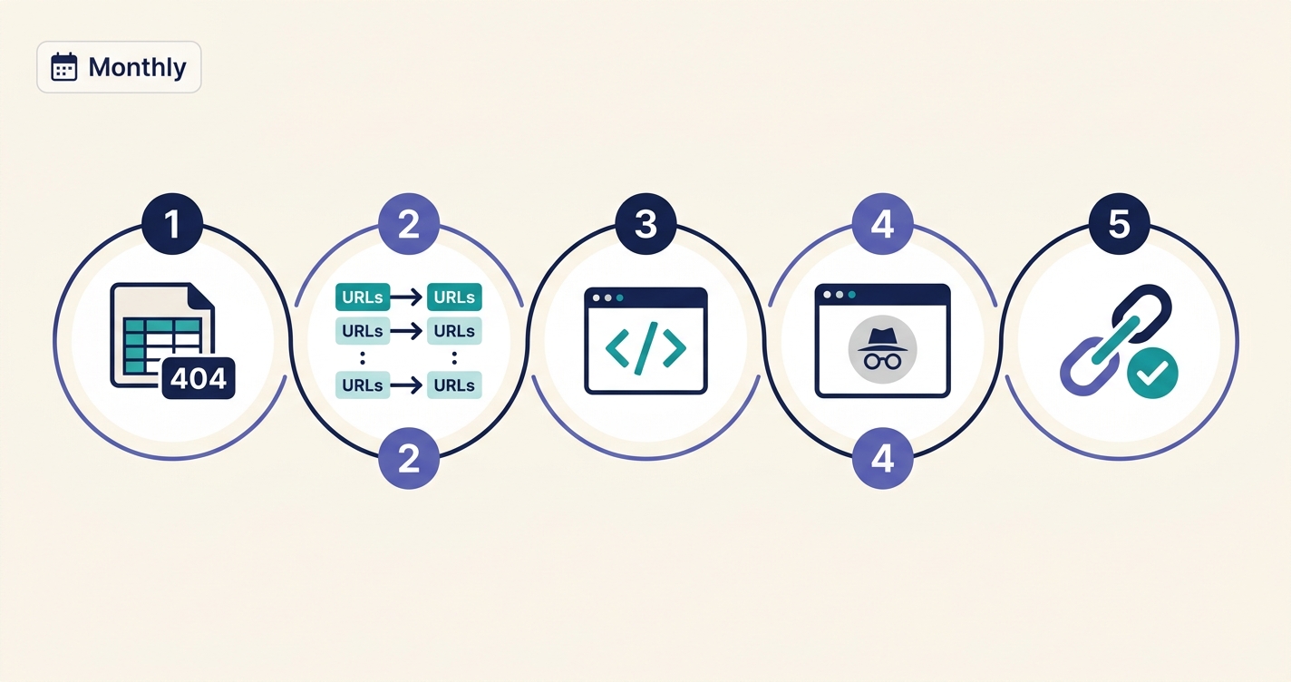
Low contrast is one of the most common accessibility failures on the web, but once it is fixed, five other small changes make a blog much easier to use — for people using screen readers, keyboards or zoom, and for everyone else too.
1. Write real alt text
Describe what the image shows and why it is there, in one sentence: "Line chart: page load time falling from 4.2 s to 1.8 s after enabling caching." Skip "image of" — screen readers already announce that it is an image. Purely decorative images get an empty alt="" so they are skipped. WordPress has an Alt Text field in the Media Library and in every Image block; our image size guide covers the file side of images.
2. Keep heading order honest
One H1, then H2 for sections and H3 inside them. Screen-reader users jump between headings the way sighted readers skim, and skipping from H2 to H4 because "H3 looks too big" breaks that map. Change the style, not the level.
3. Make link text say where it goes
"Read our hosting guide" beats "click here". Links are often read out of context in a list, and descriptive anchors also help search engines understand the destination — the same advice as in our internal linking guide.
4. Never hide the focus ring
Keyboard users move through a page with Tab and need to see where they are. Many themes and "clean CSS" snippets set outline: none. Replace it with a visible :focus-visible style — a 3px outline in your accent color is enough, and mouse users will not see it, because :focus-visible does not appear on a normal click.
5. Respect zoom and motion
Text should reflow at 200% zoom without sideways scrolling, which mostly means relative units and no fixed-width containers. If anything on the page animates, wrap it in @media (prefers-reduced-motion: reduce) and switch it off for readers who have asked their device for less motion. Both are quick checks in any browser.
Common mistakes
| Mistake | Why it fails | Fix |
|---|---|---|
| Testing only on a bright desktop monitor | Laptops at low brightness and phones outdoors show far less contrast | Check on a phone in daylight, and trust the ratio over your eyes |
| One light grey for every "secondary" element | Captions, dates and excerpts are normal-size text and need 4.5:1 | Pick one secondary grey that passes (#595959–#767676 on white) and use it everywhere |
| Removing link underlines | Color alone does not identify links reliably, and the 3:1 link-to-text rule is hard to meet | Keep underlines, or add a visible bottom border |
| White text on a bright accent button | Mid-lightness hues (mint, orange, sky blue) land near 3:1 | Darken the button 15–20% or use a dark label |
| Checking text only | Borders, icons and focus rings also need 3:1 | Audit form fields, icons and focus states too |
| Relying on a drop shadow to lift text off a photo | Checkers ignore shadows, and busy photos defeat them | Use a solid or semi-transparent overlay behind the text |
| Red and green alone for "error" and "success" | Invisible to many people with color vision deficiency | Add an icon or a word, so the color is a bonus rather than the message |
Troubleshooting
"I changed the color in the Customizer but the page did not change"
Three usual causes. A caching plugin or CDN is serving the old CSS — purge it. A child theme or "Additional CSS" rule overrides the setting — search your custom CSS for that element's class. Or the color is stored inside the block itself (Elementor widgets and some Gutenberg blocks keep their own colors). The browser inspector shows which rule wins; overridden rules appear crossed out.
"The text is on a gradient — which color do I test?"
Test the text against the lightest and the darkest colors in the gradient separately. The pair must pass at both ends. If it does not, flatten the gradient behind the text or put the text in a solid box.
"My theme uses semi-transparent text (rgba)"
The color you see depends on what is behind it. Blend it first: white text at 70% opacity over #1a1530 shows as roughly #bab9c1. Enter that blended color in the lab. Simpler still, replace the transparency with a solid color that passes.
"Automated audits give me different numbers"
Lighthouse, axe and WAVE use the same WCAG formula, so their ratios should match closely. Differences usually come from one tool reading the rendered colors (after opacity, overlays and dark mode) while you entered the intended colors. The rendered value is the one that counts.
"The checker says my brand color fails for body text"
Most saturated brand colors do. Use the brand color for large headings, buttons with a dark label, borders and accents, and a near-black for paragraphs. That is how most professional sites handle it.
Frequently asked questions
What is a good contrast ratio for a website?
At least 4.5:1 for normal text and 3:1 for large text and interface elements, which is WCAG level AA. For body text, aim higher: 7:1 or more is comfortable for long reading and meets AAA.
Is pure black on pure white too harsh?
It is the maximum ratio (21:1) and perfectly acceptable. Some designers prefer a very dark grey such as #1a1a1a (17.4:1) or #222 (15.9:1) for a softer look; both pass AAA easily, so the choice is about style, not accessibility. Problems start when body text gets lighter than about #595959.
Do I need AAA?
Rarely as a requirement. AA is the level most laws and standards refer to. AAA is a good target for the body text of long articles, because it helps readers with low vision and older readers, but it is impractical for every element on a page.
How do I check contrast in Chrome without a separate tool?
Right-click the text and choose Inspect. In the Styles panel, click the small color square next to the color value. The color picker shows the contrast ratio with AA and AAA marks against the detected background, and draws a line showing where passing colors begin.
Does color contrast affect SEO?
Not as a direct ranking factor. It affects how people use your pages — reading time, bounces, return visits — and that shapes how your content performs. Google's Lighthouse audit flags low contrast in its Accessibility section, so it is an easy issue to spot and fix.
What about dark mode?
Same thresholds, same formula. The usual failure is mid-grey text on a dark grey background. Light text such as #e5e5e5 on #1a1a1a passes comfortably (13.8:1). If readers say pure white on pure black makes letters seem to glow, a slightly softer pair such as #e8e8e8 on #121212 (about 15:1) is a popular compromise.
Which tool can check contrast across a whole page?
Browser-based auditors are the most reliable: Lighthouse (built into Chrome), the axe DevTools extension and the WAVE extension all list every text element that fails on a page. To check many pages at once, use a site crawler or online scanner with an accessibility module. We have not tested every option and do not name one as the best.
Conclusion and next step
Contrast is a rare kind of improvement: measurable, cheap and visible straight away. Learn the two numbers — 4.5:1 for text and 3:1 for large text and controls — check the eight pairs your theme actually uses, and darken or lighten instead of recoloring. Then spend the ten minutes you have left on alt text, heading order and focus rings. Your readers will not notice any of it, and that is the point.
Next step: open your most-read post on your phone, paste its body-text and caption colors into the Contrast Lab above, and fix the first pair that fails. If you are also working on how fast your pages load, our guide to Core Web Vitals in WordPress is the natural companion to this one.
Related guides on ThemeZone
Sources
- W3C — WCAG 2.2, Success Criterion 1.4.3 Contrast (Minimum) and 1.4.6 Contrast (Enhanced)
- W3C — WCAG 2.2, Success Criterion 1.4.11 Non-text Contrast
- W3C — definition of relative luminance and contrast ratio
- W3C — Technique G183: links distinguished by color
- MDN Web Docs — Color contrast
- European Commission — European Accessibility Act
- Google — AdSense Program policies